It goes without saying that Soju is the drink that can be paired with anything—from yogurt and coffee to any kind of Korean dish. Now here’s something that may come as a bit of a surprise: Soju is also best paired with art.
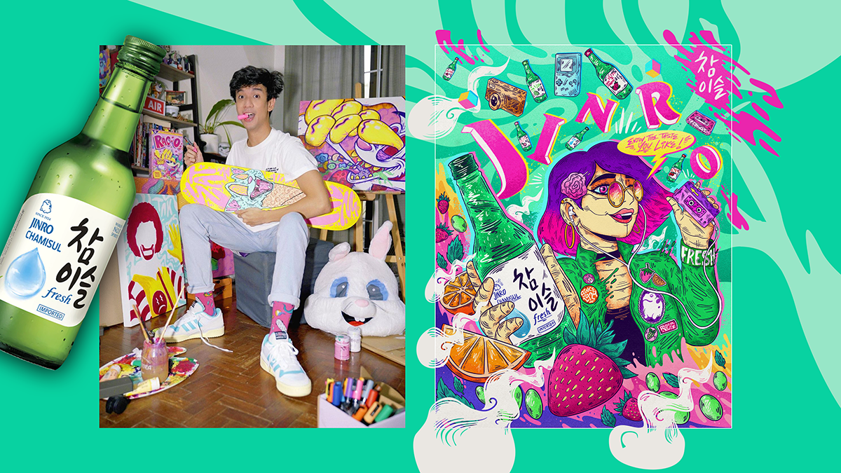
Take it from the new collaboration between JINRO Soju and Filipino visual artist Raco Ruiz who created a special illustration that doubles the fun of consuming a bottle of South Korea’s and the world’s best-selling alcoholic drink.
Soju is a popular Korean liquor made from rice, wheat, or barley, and JINRO stands out for its clean, crisp flavor. In addition to its delicious taste, Soju is known for its ability to inspire and stimulate conversation. Many people find that drinking Soju helps to break the ice and encourages a more relaxed and open atmosphere, making it the perfect choice for social occasions and for inspiring flair and creativity.

The collaboration marks the first time JINRO partnered with an artist in the Philippines to bring its fun and fresh offerings to more people in the country.
In an exclusive interview with PhilSTAR L!fe, the young artist admitted feeling “honored and privileged” to be the first artist to jump-start the Soju brand’s initiative.
He elaborated, “Super kinilig ako when JINRO reached out to me for a collab kasi I really think that if I were to be a drink, I would be JINRO because the flavors are reminiscent of childhood flavors—like fruit-flavored drinks—pero it knows how to have fun in an adult setting.”
Raco has been making a name for himself with his eye-popping illustrations influenced by surrealism, graffiti art, pop art, and low brow cartoons. He is part of the top-tier talents of NYMA, the talent management arm of Kroma Entertainment. One look at his Instagram feed and you will know it’s a style unique to himself as he only uses neon pastel colors reminiscent of a “candy shop.”

A graduate of Communication Arts at the De La Salle University, Raco shares his masterpieces not only on Instagram, but also by incorporating them in his witty and relatable videos on his TikTok page with a following of almost 200,000 as of writing.
Beyond the online world, you can also find Raco on your TV screens as a PIE jock! PIE stands for Pinoy Interactive Entertainment, and is the country’s first “tradigital” entertainment channel powered by innovative entertainment company KROMA, fast-rising venture builder 917Ventures, and the country’s leading storyteller and entertainment network ABS-CBN.
All these are a reflection of how the creative nomad is always pushing beyond the ordinary when it comes to his passions.
He continued, “That’s one thing I want to incorporate in myself as an artist—kelangan parating may flavor. It can never be bland. I want to be fun. Kahit when I have to make an artwork with a subject that’s dark or grotesque, I make it look like it’s made for a candy shop or for a fun flavorful brand.”
That is why Raco made sure to channel the same bright energy into his collaboration with JINRO. The drawing bears the artist’s distinct style with its surreal motif made more striking with a candy-inspired color palette.

Raco described his illustration as a “fusion of past and future” influenced by the fact that JINRO “has been around for such a long time and people young and old are enjoying the brand.”
“I incorporated a lot of retro elements, and even in the vibe of the illustration, I drew inspiration from retro ads but wanted to have a fresh touch to it by making the girl a robot,” he said.
Apart from having the freedom to include elements to his own liking, Raco admitted having a good time working on this illustration as JINRO gave him the liberty to select the colors to spice it up. It’s a new challenge, Raco said he was excited to take on as he spoke about choosing a palette for the illustration.
“I just went wild with it. I just put as many colors as I can without making it look too chaotic,” he remarked.
Raco based these colors, first and foremost, on his personal art style which aims to break gender norms wherein blue is only used by boys, while pink is exclusive to girls.
“I always use secondary colors. I make it like a rule. As much as possible, I don’t use blue, or as much red or yellow ‘Cause I like challenging myself,” he explained. “Growing up, syempre the stereotype is purple or pink is for girls, ‘di ba? Pero I said: you know what, guys dont usually like using pink and purple so I think I’ll make that my thing”
Meanwhile, he made the background similar to that of JINRO’s summer green pantone used for the brand’s logo and iconic bottle.
“For JINRO, of course, their bottle’s green,” Raco continued. “A lot of their ads also have minty pastel hues in them so I thought I’ll Incorporate more green tones in this artwork.”
Raco also created the illustration in such a way that it converses with the audience, as “inspired by vintage ads where only one person is holding the drink, making the viewer the second character.”
“Instead of putting two characters, I said, ‘Why not make the audience the second character?’ Kaya I made the subject look at the audience, making a ‘cheers’ gesture to the person looking at the photo,” he continued. “In a way it’s interactive, it is talking to the audience.”
But Raco desires to build a connection with his audience not only through their eyes, but more so, through their emotions. For this artwork, in particular, the talented illustrator wants people to feel the delight of being at a party, just like what JINRO Soju gives him in every bottle.
He said, “Every time I drink JINRO, I have a good time because the feeling you get from the drink is not too much, sakto lang. It’s just the right amount of buzz to keep yourself awake, elevate fun to the next level, without flushing too hard after.”
“This generation is a super busy generation. We’re doing a lot of things, so we can’t really afford to take a day off just to recover form a night out,” he continued. “So I think JINRO is not just a fun drink to consume, but also very practical. So I think that’s the best of both worlds.”
Originally published on PhilStar Life.